Product & Brand Strategy, 2014
Collaboration with Vidhi Goel under the guidance of aruliden
Featured on Fast Company, PSFK, Experimenta Magazine, Notcot, KlonBlog
“Bud” is a smart pregnancy companion that acts as a support system for pregnant women. The device emerged from the design brief of “Reimagining home monitoring." The project celebrates pregnancy for parent and child—a precious time that deserves care and attention, and a product category not yet addressed in the from a technology standpoint that is user-centric and humanistic.

Brand Identity
Helping pregnant women survive and thrive through their “bumpy 9-month journey,” the Bud device—the name comes from both a budding flower and a trusted companion—cherishes the little one growing inside, while giving the mother the confidence that her pregnancy is on track.


Brand Pyramid: Bud's brand essence is offering mothers and their families a spirited journey. It celebrates and educates pregnant women by providing them with analog feedback, comfort in their pregnancy progression, and a unique memento of their adventure.

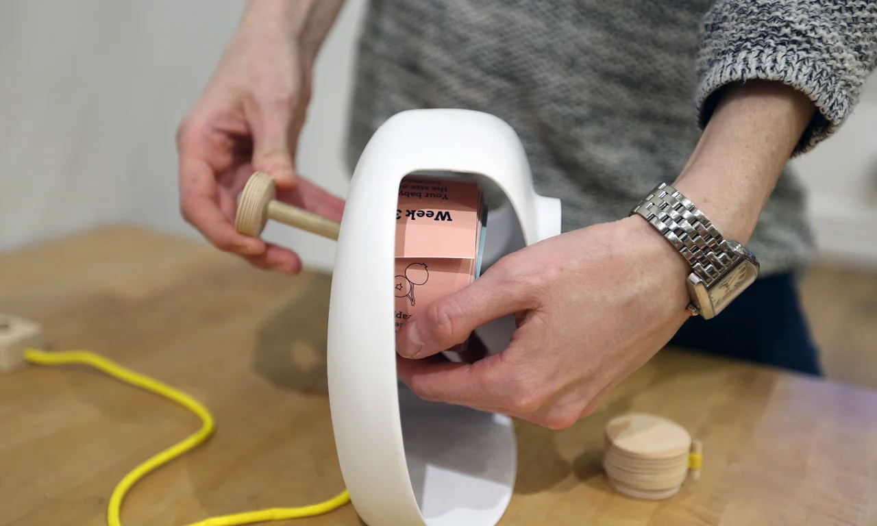
Product Ecosystem: At its core, Bud uses smart printer technology to print daily messages about the stage of the mother’s pregnancy and characteristics of the baby’s development and growth. Bringing existing technology into a new context, the device pairs with the Bud platform, pulling in data from trusted pregnancy resources such as Ina May’s Guide to Childbirth, and the Mayo Clinic’s Guide to a Healthy Pregnancy.

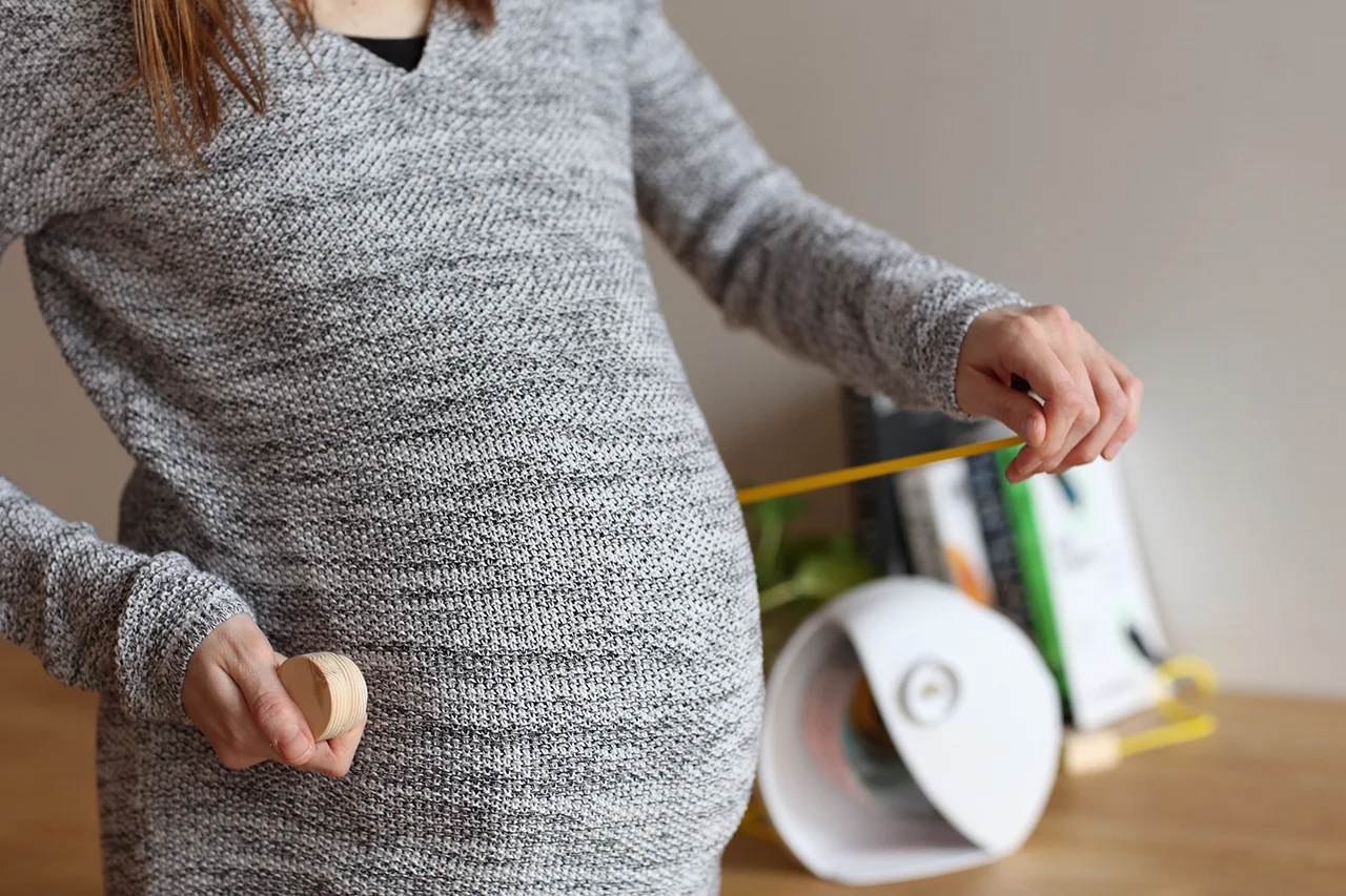
Built-in Smart Tape Measure: Once the device is set up, the mother uses the built-in smart tape measure to wrap around her belly, providing a starting data point for the device. Weekly tape measurements are used to correlate the size of the belly with the stage of pregnancy, insuring that the information provided on the device is perfectly synched with the mother’s and baby’s growth.


Daily Messages: The messages on the tape celebrate milestones for the baby (from when webbed hands become fingers to the emergence of teeth and hair) to important medical information (around nutrition, blurred vision, and weight gain). Bud shares these updates, along with quirky facts and other medical suggestions on a daily basis, providing a conduit for information that is timely, charming, and useful.

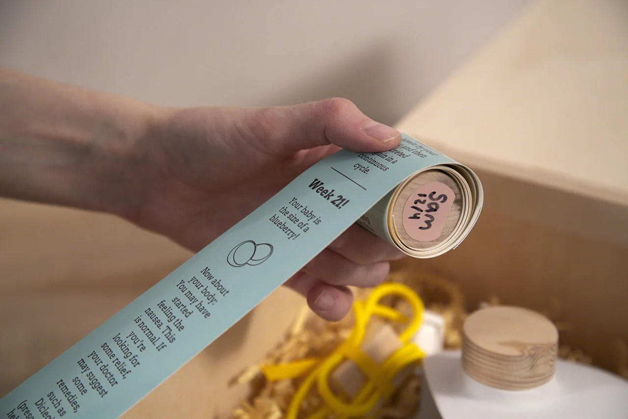
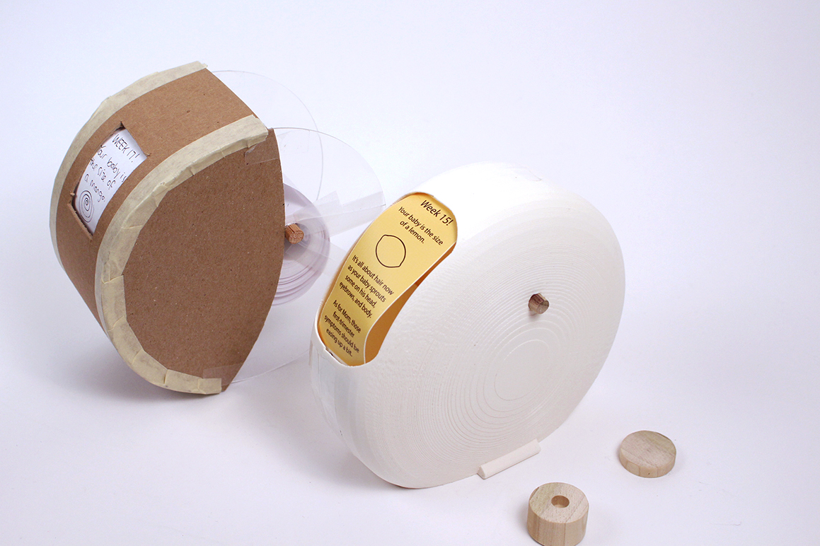
Growing Spool: The form of the growing scroll of printouts represents the growing life in the mothers belly—a visual metaphor for anticipation, and the transition between the three trimesters of the pregnancy is visualized on the tape’s background color with a gradient from yellow to blue to pink. The two designers remark, “Bud makes the invisible moments of pregnancy visible.”

Changing Trimesters: The transition between the three trimesters of the pregnancy is visualized on the tape's background color with a gradient from yellow to blue to pink.

Personalizing Printouts: Additionally, moms can send photos, texts, and snapshots to the device from their phone, making the printouts even more personal to their journey.
Removing Spool


Labeling Spool
Keepsake: At the end of the 9 months, the printed spool becomes a keepsake that enables moms to revisit their pregnancy memories years down the road.
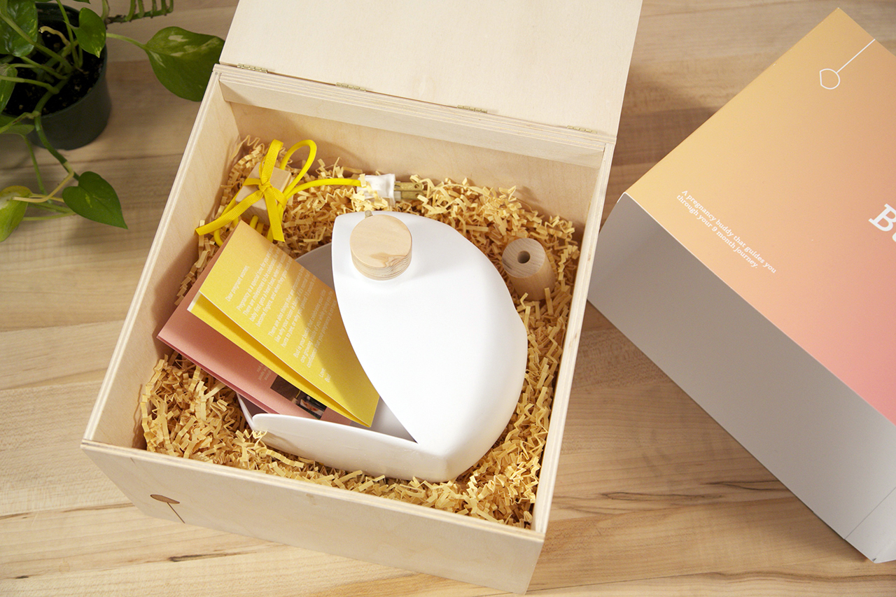
Packaging: The packaging of Bud speaks to the preciousness of the device, providing moms the experience of lifting an egg out of its nest, and then storing the device after the pregnancy is complete.


Baby Registry Gift: The product would be sold at premium baby and maternity stores such as Giggle, and make for an ideal baby registry item as a personalizable, one-of-a-kind gift.

Technical Details
Process

Research: Looking at the types of pregnancy products that are currently on the market revealed the opportunity to design a bonding device in the technological realm.

Bud had a birthing process too! The shell of Bud was 3D printed. After apply spackling paste, sanding, and priming, Bud's shell replicates Ceramic material.
Prototypes

Process: From establishing the brand identity to storyboarding to product/ market strategy to building the actual device, Bud was born.


Mood boards: To align the brand language and tone with the product itself, we created mood boards. On the left is the form moodboard and on the right is the material moodboard. Overall, we wanted to create a curvy form, a ceramic look, and seamless transition points between the different components of the product.